The Color Grading Debate: A Nostalgic Journey from Sailor Moon's Controversy to Dragon Ball's Green Sky

Sailor Moon's color controversy sparks nostalgia with Dragon Ball's green-sky debacle Explore the significance of color grading and delve into fan reactions to Sailor Moon's official master colors
Both Sailor Moon and Dragon Ball anime, despite being older and airing decades ago, are considered iconic within the anime community. Many fans view them as the shining examples of Shoujo and Shonen anime. Surprisingly, they share a major similarity - both were produced by Toei Animation.
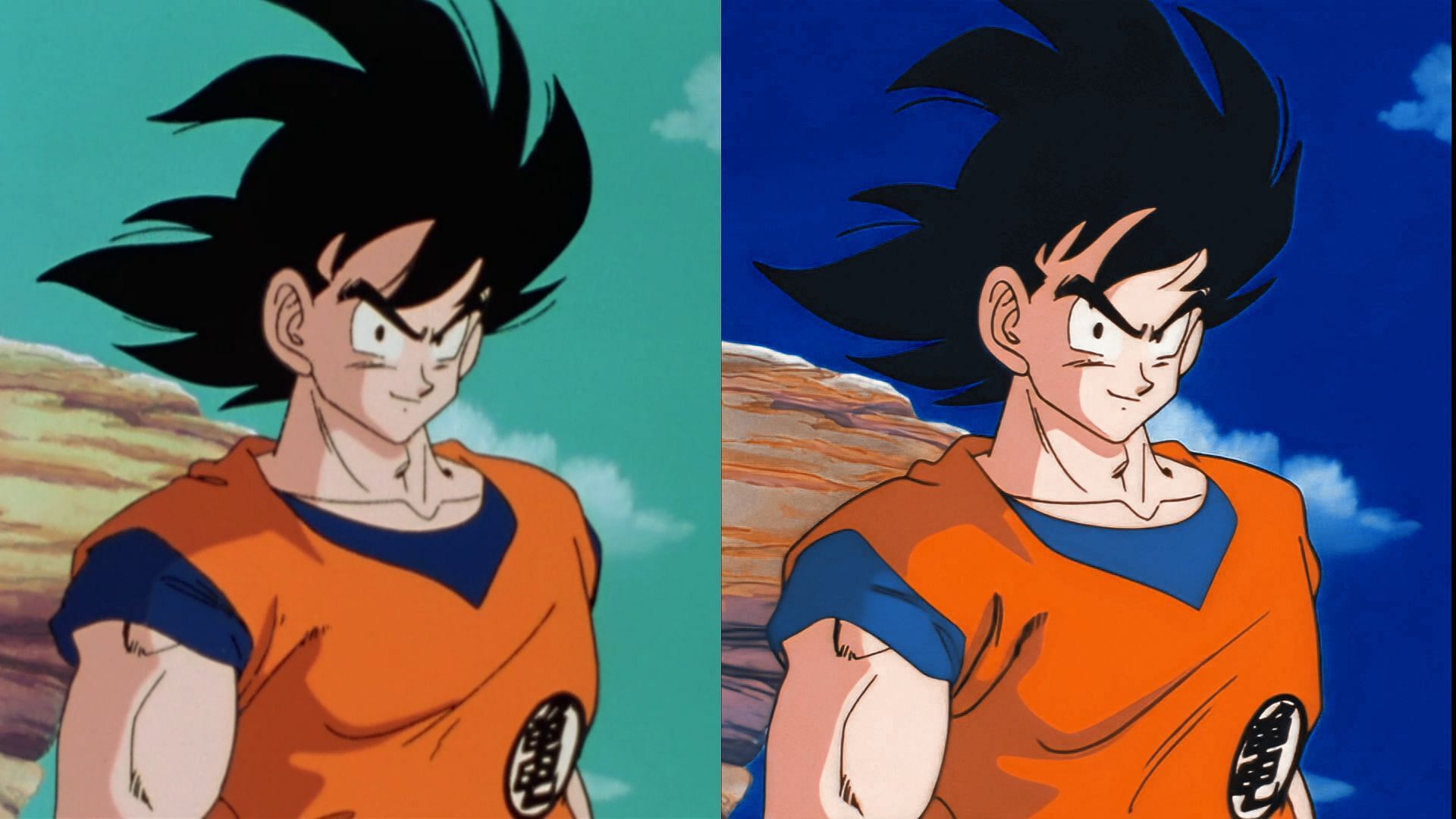
Even now, if one were to watch either anime, they may notice Dragon Ball's green-tinted skies and Sailor Moon's reddish hue, leading them to believe that the color grading for anime was different in the past. However, this assumption is incorrect, as these hues were not intentionally created by the animation studio, but rather a result of general degradation over time.
Sailor Moon's official master colors remind fans of Dragon Ball's green-sky debacle
On January 9th, a professional translator on X @nappasan posted a comparison video showing the difference between the Sailor Moon anime that fans had been watching and how it should have officially appeared. The post creator noted that when considering the white balance and color of the cel animation image, the colors of the anime should have been much whiter. Conversely, the official master for the same had degraded and become too red.
This deviation was far from what the original creators had intended to portray. Nevertheless, fans like it, believing that it fits the overall vibe of the anime.
What is color grading and what happened with Dragon Ball?
The disparity in hues between the actual release and the intended version (Image via Toei Animation)
Color grading involves establishing a specific color palette for an image, such as imparting a reddish or bluish tint. This technique is frequently utilized during the post-production phase of film and video editing to modify the visual presentation of an image and depict various atmospheres.
When Dragon Ball was first released for home viewing, fans were quick to notice that the skies in the anime often looked green. This led to speculation that Toei Animation had intentionally altered the color palette of the official master.
In truth, the discoloration was a result of the film scans fading over time. However, instead of correcting the issue, Toei Animation released the home versions as they were. Similar problems were also noted in other Toei anime, including the Goldfish Warning! series.
Now, as evident from the post by @nappasan, this was also the case for Sailor Moon anime.
How fans reacted to Sailor Moon's intended color revelation
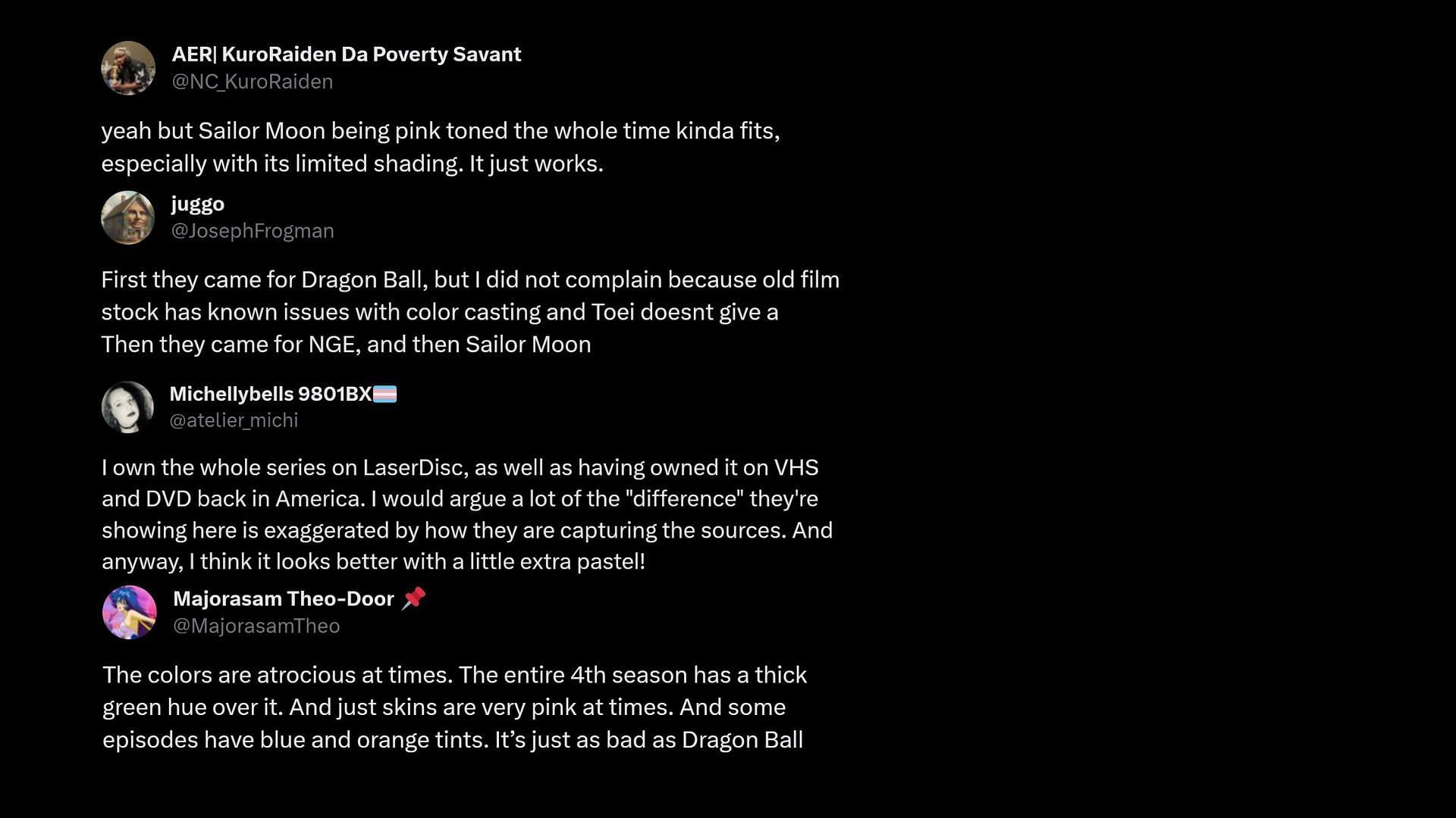
The reaction from Sailor Moon and Dragon Ball fans to the revelation of the degraded colors was captured in this image (Image via Our Website/X).
The majority of anime fans expressed support for the color grading, having grown up watching it and believing that the reddish hue perfectly matched the vibe. According to many fans, the reddish hue added a romanticized touch to the anime, making it more in line with the "girlier" aesthetic of the Shoujo genre.
Some fans were overly attached to the versions they had seen and didn't want to face the reality that their favorite anime could be improved. Others agreed with the original creator and thought that the colors were sometimes too harsh, hoping that Toei Animation would make some adjustments. However, they also expressed an appreciation for a lighter pastel tone if it was used in moderation.
Editor's P/S
As a long-time fan of both Sailor Moon and Dragon Ball, I was fascinated to learn about the color grading controversy surrounding these iconic anime series. The revelation that the reddish hue of Sailor Moon and the green skies of Dragon Ball were not intentional creative choices but rather the result of degradation over time added a new layer of appreciation for the original works.
It's understandable why fans have grown attached to the color grading that they have come to associate with these anime. The reddish hue of Sailor Moon has become synonymous with the series, and it's easy to see why fans would be hesitant to embrace a change. Similarly, the green skies of Dragon Ball have become a defining characteristic of the anime, and fans may feel that altering this would diminish its charm.
