Warning: The following contains SPOILERS for episodes 1 & 2 of My Adventures With Superman. In the show, the Superman logo went through a minor design change that added more depth to the character's symbolism. This new animated series takes inspiration from both the classic Superman mythology and anime styles to create its unique look. In order to promote diversity and realism, a few alterations were made to the traditional Superman story. However, the alterations to the logo were specifically made to highlight a key aspect of Superman's character.
The meaning behind Superman's logo has greatly evolved over time. Initially, it was a simple "S" representing Superman. However, during the filming of 1978's Superman: The Movie, actor Marlon Brando suggested that the design resemble the family crest of the House of El, resulting in the distinct diamond shape. This concept was later incorporated into the comics by writer Mark Waid in 2004's Superman: Birthright, where the logo was associated with the Kryptonian symbol for "hope." In 2009's Superman: Secret Origin, Geoff Johns solidified both explanations as part of the official canon. Despite these changes in meaning, the actual design of the Superman logo has remained relatively unchanged throughout the years.
Superman's New Logo & Costume Fit What Superman Represents
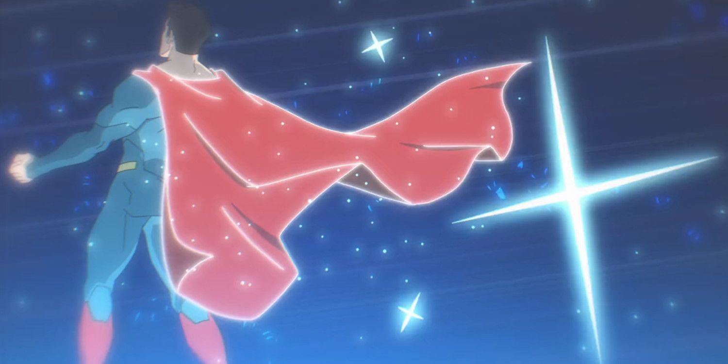
The Superman logo in My Adventures With Superman has a sharper and more angular design compared to the classic one, which has soft curves. This distinctiveness makes it appear less like the familiar "S" shape and more alien in its characteristics. It also serves to highlight the harshness of Kryptonian culture, which has been depicted as fascist, isolationist, and xenophobic in various interpretations. Subsequently, this subtly reinforces young Clark Kent's rejection of his alien heritage, particularly after a disturbing encounter with a hologram of Jor-El while exploring the spaceship that brought him to Earth.
This effectively reinforces a crucial aspect of Superman's core character throughout all forms of media. Despite his human-like appearance, Superman is fundamentally an extraterrestrial being. Paradoxically, he is guided by human emotions and deliberately chooses to live an ordinary human life, rather than asserting himself as a ruler or deity. Many interpretations, such as the DCEU Superman, struggle to effectively convey Superman's outsider nature and the feelings of alienation he experiences in relation to humanity. However, this concept contradicts Superman's history, as the revelation of his alien origins does not alter Clark Kent's true identity or the values instilled in him by his adoptive parents, Jonathan and Martha Kent.
Why My Adventures With Superman Changed Superman's Logo
honors the rich history of My Adventures With Superman while also highlighting the dual nature of Clark Kent's persona through his distinctive attire. In the premiere episode, Clark reluctantly confronts the Jor-El hologram and eventually obtains his iconic super-suit. Resembling the trunkless armor of the New 52 Superman, Martha Kent suggests that the ensemble needs an additional element like a belt or shorts to enhance its appearance. This not only softens the stark look of the Kryptonian costume but also fuses elements of Kryptonian and human fashion, representing the internal conflicts within Clark's identity.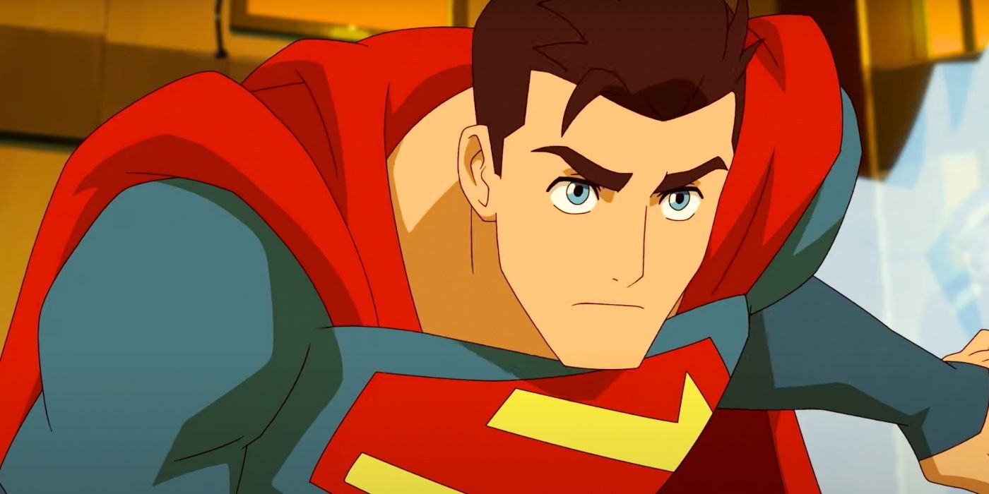
The new Superman logo not only stands out as a more unique and alien design, but it also serves a practical purpose for the team behind My Adventures With Superman. Kris Anka, the artist and character designer who contributed to both My Adventures With Superman and Spider-Man: Across The Spider-Verse, explained on his personal Twitter that his main objective was to create something simpler and more streamlined, while still being instantly recognizable as Superman's emblem. Since animating curved lines can be challenging, the straight-lined logo featured in My Adventures With Superman allows animators to reproduce the symbol quickly and consistently.
Kris Anka successfully achieved his goal of creating a "fresh" logo for Superman, which beautifully represents Superman's duality. The new House of El logo retains the recognizable colors and diamond-cut shape, firmly establishing its connection to Superman. However, it also possesses an intriguing otherworldly quality, evoking a sense of strangeness akin to something far beyond Earth both physically and culturally. As a result, it becomes the ideal centerpiece for a Superman costume that seamlessly blends human ingenuity with alien practicality. Moreover, it symbolically reflects how My Adventures With Superman maintains the essence of this beloved American icon while presenting it through an anime-inspired aesthetic.
Don't forget to catch My Adventures With Superman on Adult Swim every Thursday and on Max every Friday.