Leaked: Magnificent High Evolutionary Concept Art for Guardians of the Galaxy Vol 3

Guardians of the Galaxy Vol 3 unveils a fresh take on High Evolutionary with stunning concept art, revealing the imaginative process behind Chukwudi Iwuji's character design
The High Evolutionary has undoubtedly cemented his place as one of the MCU's most memorable villains, following his appearance in Guardians of the Galaxy Vol. 3. Chukwudi Iwuji's portrayal of the character was undoubtedly impressive, but it was the character's design that truly set him apart and made him a force to be reckoned with.
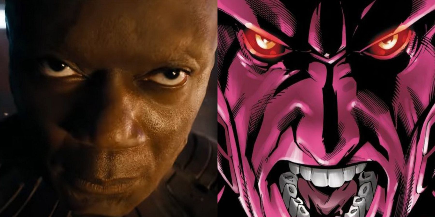
Interestingly, the High Evolutionary's on-screen appearance in Guardians of the Galaxy Vol. 3 differs from his comic book design. In the comics, he is depicted as having a sleek, robotic appearance, with his entire body covered in a pink-colored metal suit. This gives him a distinctly machine-like appearance that sets him apart from other characters. However, in the movie, the High Evolutionary's design is slightly more human-like. In flashbacks, we see him with a more natural appearance, before he begins to incorporate more technology into his anatomy. By the time we see him in the present day, he has become mostly robotic, with only a few human features remaining. One of the most striking of these features is his face, which is stretched over robotic parts rather than muscle and bone.
Andy Park, the Marvel Studios Director of Visual Development, revealed that the High Evolutionary character originally designed for Guardians of the Galaxy Vol. 3 was different from the final version. Park shared a piece of concept art on Twitter that showcased a design closer to the High Evolutionary's comic book appearance. He explained that concept art allows for exploring various possibilities, and this was one of his earliest attempts during preproduction. While many fans praised the concept art, some questioned the change in color palette from red to purple in the final design, wondering if the character would blend in with other purple villains like Thanos and Kang.
The lack of response from Park in the comments has left fans without an official answer regarding the reason for the drastic design change. A valid question raised by @NgwenyaTM is whether Marvel Studios is concerned about their major villains having a similar appearance and becoming less distinguishable. However, it appears that Marvel is not worried about this issue and may have intentionally chosen to give the villains a similar color palette. This approach could actually enhance the villains' distinctiveness and set them apart from the heroes. Interestingly, this strategy is reminiscent of Disney's long-standing practice of using the color green to differentiate villains such as Scar, Maleficent, and Ursula from the protagonists in their movies. Given that Disney is the parent company of Marvel Studios, this may be a deliberate and effective approach.
Guardians of the Galaxy Vol. 3 is playing in theaters now.
Source: Andy Park/Twitter


