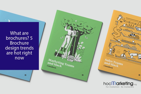
What are brochures? 5 Brochure design trends are hot right now

Discover the latest brochure design trends with this informative article. Learn how minimalist design, bold typography, and interactive elements can elevate your brochure's impact. Find the right design for your business and create successful brochures.
Brochures have been a staple in marketing materials for businesses for many years. They are a powerful tool for conveying information about products, services, and promotions in a concise and visually appealing way. A well-designed brochure can capture the attention of potential customers and leave a lasting impression. In this blog post, we will explore the importance of brochure design and highlight five hot trends that are taking the industry by storm. From minimalist design to unique shapes and folds, we'll cover it all. Additionally, we'll provide tips on how to choose the right brochure design for your business and offer suggestions for successful brochure design. Keep reading to learn more about the world of brochure design.
1. What are Brochures?
Brochures are marketing materials used by businesses to promote their products, services, or events. They are typically printed on paper and can be folded in various ways to create multiple sections or panels. Brochures can contain a variety of information, including product descriptions, pricing, contact information, and images. They are often distributed at trade shows, events, or through direct mail campaigns. In the following sections, we will discuss the importance of brochure design, current design trends, and tips for successful brochure design.
2. Importance of Brochure Design
Brochure design is a crucial element of any marketing campaign. It is often the first impression a potential customer has of your business, and therefore, it is crucial that your brochure design is visually appealing, informative and engaging. A well-designed brochure can effectively communicate your brand message, showcase your products or services, and ultimately, drive sales. It is important to keep in mind that a poorly designed brochure can have the opposite effect and turn potential customers away. Therefore, it is essential to invest time and effort into creating a striking and effective brochure design. In the following sections, we will explore the hot brochure design trends and provide tips for successful brochure design.
3. Hot Brochure Design Trends
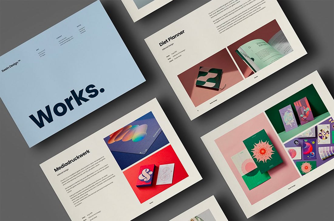
Brochure design is an important aspect of marketing and promotion for any business. A well-designed brochure can make a lasting impression on potential customers and communicate the brand's message effectively. There are several hot brochure design trends that are currently popular and can help businesses create eye-catching and engaging brochures.
One of the most popular brochure design trends is minimalism. Minimalist design focuses on using simple and clean layouts, with a limited color palette and minimal use of text. This design trend is effective because it allows the message to stand out and be easily understood by the reader.
Another popular trend is bold typography. This involves using large and eye-catching fonts to highlight key messages and draw attention to important information. Bold typography is effective because it can make the brochure stand out and be easily read from a distance.
Custom illustrations are also a hot trend in brochure design. These illustrations can be used to add personality and uniqueness to the brochure, and can help to communicate the brand's message in a visually engaging way.
Interactive elements are becoming increasingly popular in brochure design. These can include QR codes, augmented reality, or other digital elements that allow the reader to engage with the brochure in a more interactive way. This can help to create a memorable and engaging experience for the reader.
Finally, unique shapes and folds are also a popular trend in brochure design. This involves creating brochures that have unique shapes or folds that can help to make the brochure stand out and be more memorable. These unique designs can also help to communicate the brand's message in a more creative and engaging way.
Minimalist Design
Minimalist design is a popular trend in brochure design that focuses on simplicity and clarity. This design approach emphasizes the use of negative space, clean lines, and a limited color palette to create a sophisticated and elegant look. By removing unnecessary elements and distractions, minimalist design allows the key message and information to stand out and be easily understood by the audience. This style is especially effective for businesses that want to convey a professional and modern image.
One of the benefits of using a minimalist design approach is that it can make a brochure appear more high-end and premium. By using a restrained color palette, high-quality paper stock, and subtle embellishments, such as foil stamping or embossing, a minimalist brochure can convey a sense of luxury and exclusivity. Additionally, this design style can help to create a sense of calm and tranquility, which can be particularly effective for businesses that want to promote relaxation or wellness.
Another advantage of minimalist design is that it can be highly adaptable to different types of content and messages. Whether the brochure is promoting a product, service, or event, a minimalist approach can help to keep the focus on the most important information and make it easy for the audience to engage with the content. This design style can be particularly effective for businesses that want to communicate complex or technical information in a clear and concise way.
Overall, minimalist design is a powerful tool for creating brochures that are elegant, sophisticated, and easy to understand. By emphasizing simplicity and clarity, this design approach can help businesses to create a strong visual identity and communicate their message effectively to their target audience.
Bold Typography
Bold Typography adds a touch of drama and personality to brochure designs. It is a popular trend that involves using big and bold fonts in different colors, shapes, and styles. Bold typography can help to highlight important messages and grab attention, making it an effective way to make your brochure stand out. It is also a great way to add personality and character to your brand.
When using bold typography, it is important to ensure that the font is legible and easy to read. It should also be consistent with your brand's personality and tone of voice. Bold typography can be used in different ways, such as for headlines, subheadings, or as a focal point of the design. It can also be used in combination with other design elements, such as custom illustrations or unique shapes and folds.
Incorporating bold typography into your brochure design can help to create a memorable and impactful piece of marketing material. It can help to convey your brand's message and identity in a way that is visually engaging and easy to understand. With the right use of bold typography, you can create a brochure that not only looks great but also effectively communicates your message to your target audience.
Custom Illustrations
Custom illustrations can be a powerful tool in creating a unique and memorable brochure design. By using custom illustrations, you can showcase your brand’s personality and values in a way that photographs or stock images simply cannot. These illustrations can also help to simplify complex concepts or products, making them more accessible and engaging for your audience.
There are a variety of ways to incorporate custom illustrations into your brochure design. One approach is to use hand-drawn illustrations, which can add a personal and organic touch to your design. Another option is to use digital illustrations, which can be more precise and polished. You can also consider combining different illustration styles to create a more dynamic and interesting design.
When creating custom illustrations for your brochure, it’s important to consider your brand’s color palette and overall aesthetic. The illustrations should complement your brand’s existing visual identity and help to reinforce your messaging. You should also consider the context in which the brochure will be used – for example, an illustrated brochure for a children’s toy company may look very different from an illustrated brochure for a financial services firm.
In addition to being visually appealing, custom illustrations can also make your brochure more memorable and shareable. People are more likely to remember and share content that is visually interesting and unique. By incorporating custom illustrations into your brochure design, you can create a piece that stands out from the crowd and leaves a lasting impression on your audience.
Interactive Elements
To make brochures more engaging, interactive elements are becoming increasingly popular in brochure design. These elements can be anything from QR codes that lead to a website or social media page to augmented reality features that allow the user to experience the product or service in a virtual setting. Interactive elements can also include pop-ups, scratch-off areas, or even mini-games that engage the reader and leave a lasting impression.
Incorporating interactive elements can help to make your brochure stand out from the competition and provide a more immersive experience for the reader. However, it's important to make sure that these elements are relevant to your business and enhance the overall message of the brochure. When choosing interactive elements, consider your target audience and what will appeal to them most.
In the next section, we'll dive deeper into the different types of interactive elements you can use in your brochure design and how to choose the right ones for your business.
Unique Shapes and Folds
Unique Shapes and Folds: Brochures don't always have to be the standard tri-fold design. In fact, one of the hottest trends in brochure design right now is creating unique shapes and folds. This can include die-cutting the brochure into a unique shape, such as a circle or hexagon, or adding folds that create an interactive experience for the reader. Unique shapes and folds can make your brochure stand out from the competition and grab the attention of potential customers. They also provide an opportunity to showcase your creativity and reinforce your brand's personality. However, it's important to keep in mind that unique shapes and folds can add complexity and cost to the printing process, so it's important to work with a professional designer and printer to ensure that your vision is executed correctly.
4. Choosing the Right Brochure Design for Your Business
When it comes to choosing the right brochure design for your business, there are several factors to consider. First and foremost, it's important to think about your target audience and what design elements will resonate with them. For example, if your target audience is tech-savvy millennials, you may want to consider incorporating interactive elements into your brochure design. On the other hand, if your target audience is older, you may want to opt for a more traditional design.
Another important consideration is the message you want to convey. If you're promoting a luxury product or service, you may want to choose a design that exudes sophistication and elegance. Conversely, if you're promoting a more playful or casual product, you may want to choose a design that is more whimsical or fun.
It's also important to consider the type of brochure you want to create. For example, if you're creating a product brochure, you may want to focus on showcasing your products and their features. On the other hand, if you're creating a company brochure, you may want to focus on your company's history, mission, and values.
Ultimately, the right brochure design for your business will depend on a variety of factors, including your target audience, message, and goals. By taking these factors into consideration and working with a skilled designer, you can create a brochure that effectively communicates your message and resonates with your target audience.
5. Tips for Successful Brochure Design
To create a successful brochure design, it is important to consider several factors. Firstly, you need to understand your target audience and tailor your design to meet their needs. Think about the message you want to convey and make sure your design is consistent with your brand image. Secondly, keep it simple and easy to read. Avoid cluttering your brochure with too much text or too many images. Use clear headings and subheadings to help guide your readers. Thirdly, use high-quality images and graphics to make your brochure visually appealing. Fourthly, make sure your call to action is clear and prominent. This should be the main focus of your brochure and encourage your readers to take action. Finally, proofread and edit your brochure carefully to ensure it is error-free and reflects your brand in the best possible light.
Summary
In conclusion, brochures are an effective marketing tool that businesses can use to showcase their products and services. With the emergence of new design trends, it's important to keep up with the latest styles and incorporate them into your brochure design. By using bold colors, unique shapes, creative typography, and engaging visuals, your brochure can stand out from the competition and capture the attention of your target audience. So, whether you're a start-up or an established business, investing in a well-designed brochure can help boost your brand's visibility and drive sales.
