The Evolution of Lyles Golden Syrup: A Refreshing Redesign for a Timeless Brand
Discover the transformation of Lyles Golden Syrup's iconic logo and packaging as it embraces a new era of design.
The Historic Legacy of Lyles Golden Syrup
For more than a century and a half, Lyles Golden Syrup has held a special place in British culinary tradition, gracing the shelves of bakers across the nation. The distinctive logo adorning its tin, depicting a lion's carcass encircled by bees, has been a symbol of heritage and history since the 1880s.
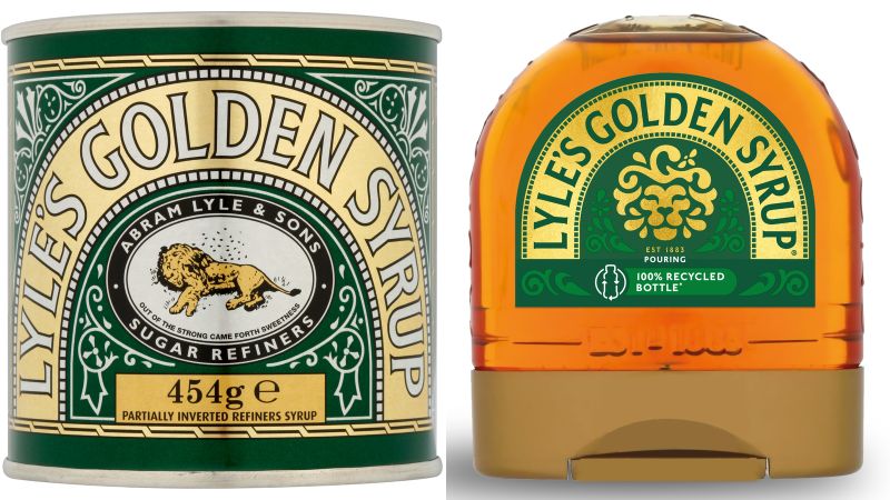
The original and new packaging and logo on Lyle's Golden Syrup. The product's canned varieties of syrup will retain the original logo.
Originally crafted by Abram Lyle & Sons in 1881, this amber-colored sweet syrup, also known as light treacle, has delighted taste buds and inspired generations of recipes. The choice of the lion and bees motif was a nod to the biblical tale of Samson, adding a layer of depth and intrigue to the brand's identity.
A Modern Makeover: Redefining Tradition for Today's Audience
In a bold move to align with the contemporary tastes of the 21st century, Lyles Golden Syrup has embarked on a major redesign of its visual identity. The new logo, a sophisticated reinterpretation of the original motif, presents the lion in a more abstract and dynamic form, with a solitary bee hovering above its head, symbolizing continuity and transformation.
The brand's evolution reflects a commitment to staying relevant and resonating with modern consumers while preserving the essence of its rich history. This strategic shift in design philosophy aims to bridge the gap between tradition and innovation, appealing to a diverse audience seeking authenticity and quality in their culinary choices.
Embracing Change and Nostalgia: Reactions to the Redesigned Logo
As the new look for Lyles Golden Syrup takes center stage, reactions from enthusiasts and critics have sparked a dialogue on the intersection of heritage and contemporary branding. While some applaud the fresh and contemporary design for its ability to capture the essence of the product's texture and feel, others express reservations about the departure from the traditional lion and bees imagery.

The product has been a staple in the pantries of British bakers since its inception. Above, a young girl about to spread the syrup on bread in 1957.
The conversation around the redesign underscores the delicate balance brands must strike between honoring their roots and adapting to evolving consumer preferences. Brand director James Whiteley emphasizes the importance of meeting current needs while preserving the nostalgia and authenticity that define Lyles Golden Syrup, acknowledging the mixed responses as a testament to the brand's enduring legacy.